WSJ + Google
2023
Remade
Following the success of our previous collaborations with The Wall Street Journal, I teamed up once again with my good friends Tim and DJ at Remade to craft three distinct short films for Google. These films revolved around showcasing how Google enhances services in the healthcare, education, and national security sectors.
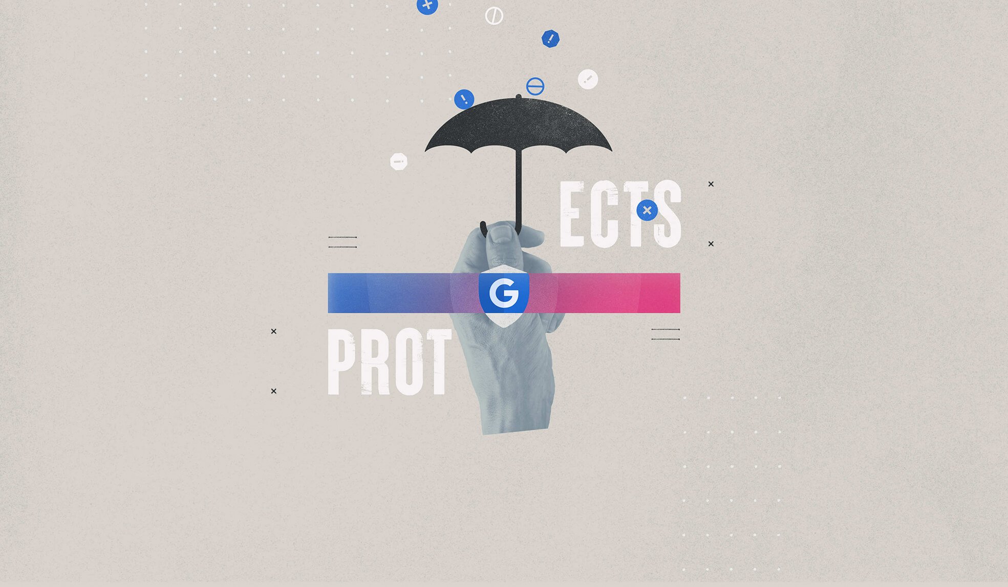
For this project, I aimed to maintain the visual continuity of our previous work, employing a collage approach. However, this time, I opted for a cleaner aesthetic—sharper lines, crisp geometric shapes, and smooth gradients of color. These elements were carefully integrated into a contrast of dark and light shots.
⤵
The animation complements this with smoother eases, cleaner curves, and snappy transitions, aligning seamlessly with the style we adopted for our films with Indeed and Zoom.
The collaboration with The Wall Street Journal and Google allowed us to explore new creative avenues while maintaining an engaging visual narrative.
Healthcare
In the healthcare-focused film, I opted for a blend of the sleek shapes reminiscent of pharmaceutical pills and the rugged edges of torn paper, along with distressed typography. Throughout the piece, you'll find moments featuring interface and UI details, paired with data visualizations creatively placed alongside raw cutouts of human eyes. This fusion of humanity and sterile data, the juxtaposition of digitized and woodcut typography with the raw hand-drawn elements, delivers a message that is both informative and down-to-earth.
Education
In the film focusing on education, I introduced an extra layer of lo-fi technology vibes. Think low-resolution bitmaps, pixelated mosaics, and edgy digital textures. We're talking retro tech here—vintage computers and laptops from yesteryear take center stage. Transitions get a glitchy and distorted treatment, merging seamlessly with the collage that includes hand-drawn elements, tangible papers ripped from spiral notebooks, and halftone photography lifted from vintage school yearbooks. It's a mix of old-school cool and digital nostalgia that brings a unique flavor to the narrative.
National Security
Now, let's dive into the film centered on national security and how Google safeguards information in the digital age. Once again, we weave data visualization with stunning cascading graphics, neatly organized in patterns alongside collage elements. Shaking things up a bit, we've tweaked the classic American flag colors – shifting from red, white, and blue to a mix of blue, white, and a touch of magenta hue.
Overall, the tone of this installment takes on a slightly more serious vibe than the previous two films in the series. Visually, it reflects the higher stakes involved, ensuring the message is delivered with a sense of gravitas.


